
You've heard of them, but do you really understand them? The name might be a little misleading, because sprites aren't little images like you might be picturing, a sprite is actually one big image. Have you ever seen the CSS technique where the "on" and "off" states of a button are contained within the same image and are activated by shifting the background-position?
Here is an example of that on CSS-Tricks.
Think of CSS Sprites as an extension of that technique. The difference is that instead of just two or three images being combined into one, you can combine an unlimited number of images into one. The origin of the term "sprites" comes from old school computer graphics and the video game industry. The idea was that the computer could fetch a graphic into memory, and then only display parts of that image at a time, which was faster than having to continually fetch new images. The sprite was the big combined graphic. CSS Sprites is pretty much the exact same theory: get the image once, shift it around and only display parts of it, saves the overhead of having to fetch multiple images.
Why combine all those images? Isn't it quicker to have smaller images?
Nope, it's not. Back in the day, everybody and their brothers were "slicing" images to make pages load faster. All that technique did was fool the eye to make it look like the page was loading faster by loading bits and pieces all over at once. Each one of those images is a separate HTTP-Request, and the more of those, the less efficient your page is.Let's look at a quote from the article "Performance Research, Part 1: What the 80/20 Rule Tells Us about Reducing HTTP Requests" by Tenni Theurer on the Yahoo! User Interface Blog.
Table 1 shows popular web sites spending between 5% and 38% of the time downloading the HTML document. The other 62% to 95% of the time is spent making HTTP requests to fetch all the components in that HTML document (i.e. images, scripts, and stylesheets). The impact of having many components in the page is exacerbated by the fact that browsers download only two or four components in parallel per hostname, depending on the HTTP version of the response and the user's browser. Our experience shows that reducing the number of HTTP requests has the biggest impact on reducing response time and is often the easiest performance improvement to make.
| Time Retrieving HTML | Time Elsewhere | |
|---|---|---|
| Yahoo! | 10% | 90% |
| 25% | 75% | |
| MySpace | 9% | 91% |
| MSN | 5% | 95% |
| ebay | 5% | 95% |
| Amazon | 38% | 62% |
| YouTube | 9% | 91% |
| CNN | 15% | 85% |
OK. So how is it done?
I thought you would never ask. Let's start by showing the BEFORE example. Notice in the CSS below how the anchor tag does not get a background-image, but each individual class does.#nav li a {background:none no-repeat left center}
#nav li a.item1 {background-image:url('../img/image1.gif')}
#nav li a:hover.item1 {background-image:url('../img/image1_over.gif')}
#nav li a.item2 {background-image:url('../img/image2.gif')}
#nav li a:hover.item2 {background-image:url('../img/image2_over.gif')}
...
Using CSS Sprites, we can really lighten this example up. Instead of having ten separate images for the buttons (five default states and five rollover states), we can literally combine all of them into one big long image. I won't go into great detail about how this is done, I'll just give you a basic walkthrough. Create a new image that is as wide as your widest image and and as tall as the combined height of all your images plus X pixels, where X is the number of images you have. Now place you images into this new image, left aligned, one on top of the other with one pixel of white space in between.
Now check out the AFTER example. Notice in the CSS that there is a single background-image applied to the anchor element itself, and the unique classes merely shift the background position with negative Y coordinates.
#nav li a {background-image:url('../img/image_nav.gif')}
#nav li a.item1 {background-position:0px 0px}
#nav li a:hover.item1 {background-position:0px -72px}
#nav li a.item2 {background-position:0px -143px;}
#nav li a:hover.item2 {background-position:0px -215px;}
...
We were able to reduce the number of HTTP-Requests by 9 and the total file size of the image(s) by 6.5 KB. That's a pretty huge improvement for such a little example. Imagine what you could do on a full website.
Ugh. That sounds like a lot of work.
Just remember what Chuck Norris once said: "All great things require great dedication." Actually I'm not sure if he said that or not, but it's good advice anyway. But fortunately for you, there is a web service which makes creating and implementing sprites really easy. There are actually lots of different services designed to help you making sprites easier, but I think hands down, the best one is SpriteMe.Using SpriteMe
SpriteMe is a bookmarklet. So after you've put it up in your bookmarks bar, just go to any website and click it. It will open up an overlay over the right side of your screen.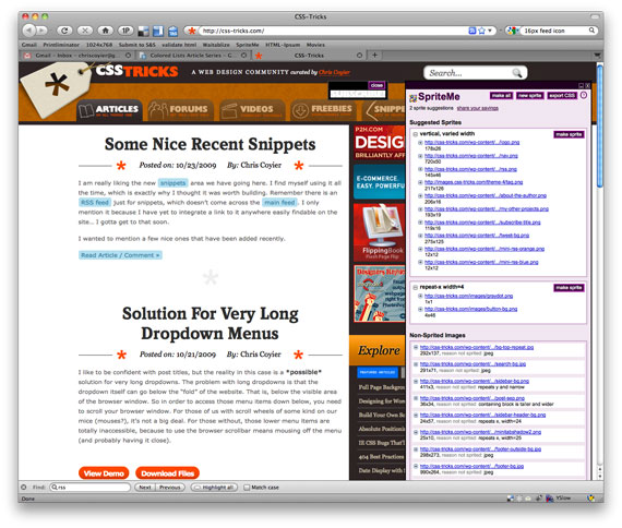
The top white box is a list of all the background graphics on your page that it feels like could be combined into a sprite. The boxes below are graphics that probably won't work for sprites (and it will tell you why). If you think differently, you can drag the links in and out of their boxes. Once you have all the images to be combined in that top box, just click the "Make Sprite" button. It will combine them all into a single image (a CSS Sprite!) that you can view right there.
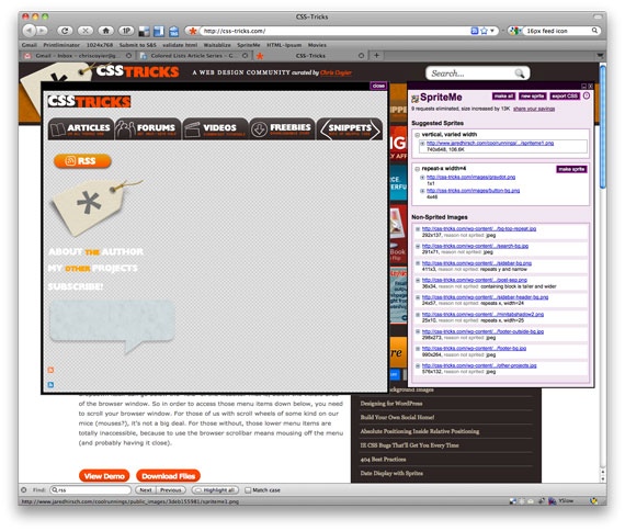
On the current design of this site, this is a (scaled down) version of the end result. (Or see the real thing)
Recently, SpriteMe also made it available to "export" the CSS. Click that button and you'll see some code like this:
A id=home-link
{
background-image: url(http://css-tricks.com/wp-content/themes/CSS-Tricks-4/images/logo.png)
background-image: url(http://www.jaredhirsch.com/coolrunnings/public_images/3deb155981/spriteme1.png);
background-position: -10px -10px;
}
A
{
background-image: url(http://css-tricks.com/wp-content/themes/CSS-Tricks-4/images/nav.png)
background-image: url(http://www.jaredhirsch.com/coolrunnings/public_images/3deb155981/spriteme1.png);
background-position: -10px -56px;
}
The crossed out code is what used to be in your CSS, and what the replacement should be is below it.{
background-image: url(http://www.jaredhirsch.com/coolrunnings/public_images/3deb155981/spriteme1.png);
background-position: -10px -10px;
}
A
{
background-image: url(http://www.jaredhirsch.com/coolrunnings/public_images/3deb155981/spriteme1.png);
background-position: -10px -56px;
}
What can't sprites do?
They don't do repeating graphics*. Sprites are for graphics that are just single blocks. Icons are a great example candidate for CSS sprites.*OK, they kinda can do repeating, but it's a little trickier and can only work one-dimensionally (x or y).
Either start from the beginning with Sprites, or do it all at the end
The using of sprites is a no-brainer. You should do it. But what is the workflow when creating a new design? I think you should go one of two routes. The first is to know that you are going with sprites from the get-go and built it as you go along. That means have a Photoshop file open, start from the upper left, and drop stuff in as you need it. If you have another icon (or whatever) that makes sense to put in a sprite drop it in there and resave it.The other way, which perhaps makes even more sense, is to develop without thinking about sprites at all. Make everything separate individual graphics. Then when the site is "complete" (or at least, ready for release, we all know sites are never "complete"), then use SpriteMe and do the spriting then.


